Reports Dashboard: A Tour Guide
Introduction
The Reports page in the Admin By Request portal gives you a visual overview of privilege activity across your environment. Rather than digging through individual audit log entries, this page rolls everything up into charts and summaries so you can spot trends, identify risky behavior, and understand what your endpoints are actually doing. Think of it as your security dashboard at a glance.
Each panel focuses on a different aspect of your environment, from your overall security posture down to which specific users and applications are seeing the most elevation activity. Most panels include a Drill down button that takes you deeper into the underlying data. At the bottom of the page, you'll find View Configuration options (see View Configuration) that let you adjust the time ranges and sub-settings shown across the charts, so you can tailor the view to what's relevant right now.
This technical note is available in PDF format:
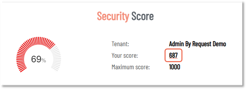
Security Score
Your Security Score is a number out of 1000, calculated based on how your EPM settings stack up against a set of security best practices. It's one of the first things worth checking when you log in, especially after a new deployment or any significant change to your configuration.
Click the value alongside Your score: to view the breakdown. In this example, the score is 687, which is the value to click:
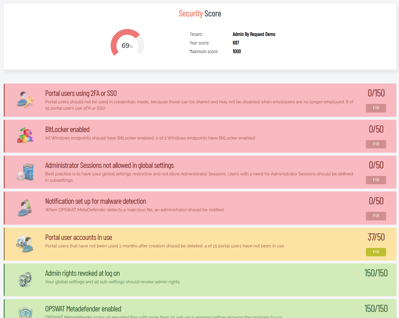
The checks cover a range of security hygiene items: whether portal users are authenticating with 2FA or SSO, whether BitLocker is enabled across your Windows endpoints, whether Admin Sessions are restricted in your global settings, whether OPSWAT MetaDefender is turned on, whether stale portal accounts have been cleaned up, and more.
The score is broken down into individual checks, each color-coded by status: green means you're in good shape, yellow means there's room to improve, and red means something needs attention. Each flagged item includes a brief explanation of why it matters and a FIX button that takes you straight to the relevant setting:
The Security Score drill-down page includes a PDF export at the bottom. If you're working toward ISO certification or another compliance framework, exporting on a regular cadence (quarterly works well for most teams) gives you a timestamped record of your security posture, which comes in handy when an auditor asks for documentation.
Refer to Getting More Out of Admin By Request: Tips and Tricks for more hints on working with Admin By Request.
Where Are My Computers Right Now?
This panel shows a live map of your managed endpoints based on their last known geolocations. Each pin represents one or more endpoints, and you can zoom in to see geographic clustering. Clicking Drill down opens the full Computer Locations report, which pairs the map with a table showing endpoint counts broken down by city and country. From there you can also export the data to PDF, XLSX, or CSV.
At a practical level, this is most useful for organizations with endpoints spread across multiple offices or countries. It's a quick sanity check to confirm devices are showing up where you'd expect them to be. If a device is suddenly reporting from an unexpected region, that's worth investigating.
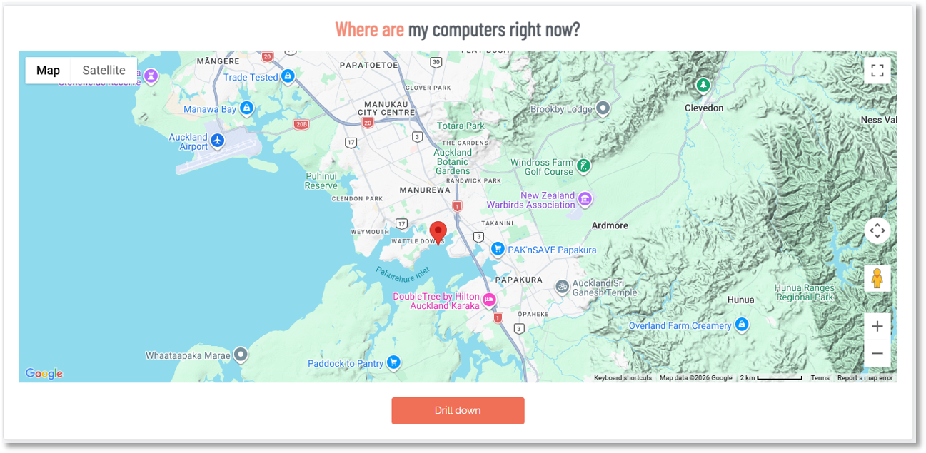
If your organization doesn't need geolocation tracking, or if it raises privacy concerns, you can disable it in the portal under Settings > Tenant Settings > Data > PRIVACY. The map panel will simply stop populating once geo-tracking is turned off.
Refer to Data Privacy Settings for more information.
User Elevations
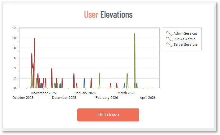
This chart plots elevation activity over time, broken down by type: Admin Sessions (time-limited, system-wide elevation), Run As Admin (per-application elevation), and Server Sessions. The X-axis is time and the Y-axis shows the volume of elevation events.
Use this panel to get a feel for your overall elevation volume and whether it's growing, stable, or spiking. A sudden spike is worth investigating: it could indicate a deployment, a change in user behavior, or something more concerning. A gradual upward trend over weeks might suggest that more users are being granted elevation access than intended.
At the bottom of the Reports Dashboard page is a View Configuration section where you can select different timeframes for spline and bar charts.
If Admin Sessions make up a large share of your elevation activity, consider whether those users actually need full system-wide elevation or whether Run As Admin would cover their needs. Run As Admin is the more restrictive and auditable option.
Elevated Applications
This bar chart shows which applications are being elevated most frequently across your environment. The longer the bar, the more often that application has been elevated in the selected time window.
This is one of the most useful panels for building out your pre-approval policies. If you see the same applications appearing consistently, those are strong candidates for pre-approval rules, so users can elevate them without requiring manual approval each time. It also helps you spot unusual applications that probably shouldn't be elevated at all.
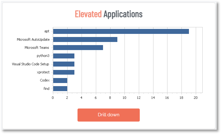
Tip: Cross-reference this panel with your pre-approval settings. Any application showing up frequently that isn't already pre-approved is creating unnecessary manual approval overhead for your team. You can pre-approve by file location, vendor certificate, or checksum from the Settings page.
User Requests
Similar to the User Elevations chart, this panel tracks the volume of elevation requests over time, split by request type (Admin Session and Run As Admin). The key distinction here is that this shows requests, not completions. A request may be approved, denied, or still pending.
Comparing this chart to the User Elevations chart can reveal useful patterns. If requests are high but completed elevations are lower, a significant number of requests may be getting denied or sitting unapproved. If they track closely together, your approval workflow is moving efficiently.
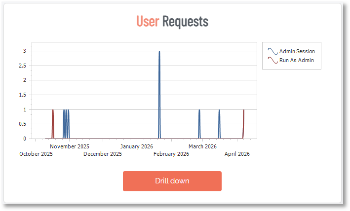
If you're seeing a consistent gap between requests and completed elevations, it's not always a sign that things are working as intended. It could mean requests are sitting unactioned because approvers aren't getting notifications, or that users are submitting requests and then finding another way around. Both are worth investigating.
Elevated Users
This panel ranks users by how many times they've had elevated access in the selected time period. It's a straightforward way to see who's requesting and receiving elevated privileges most often.
A few users showing up frequently is usually expected, especially developers or IT staff. What you're looking for are outliers: users who have no business reason to be elevating applications regularly, or standard end users appearing at the top of the list. The Drill down opens a dedicated Elevated Users report showing a "Your Top 10" chart alongside a table of users ranked by elevation count. You can switch between elevation types using the View drop-down, and filter by subsetting and date range.
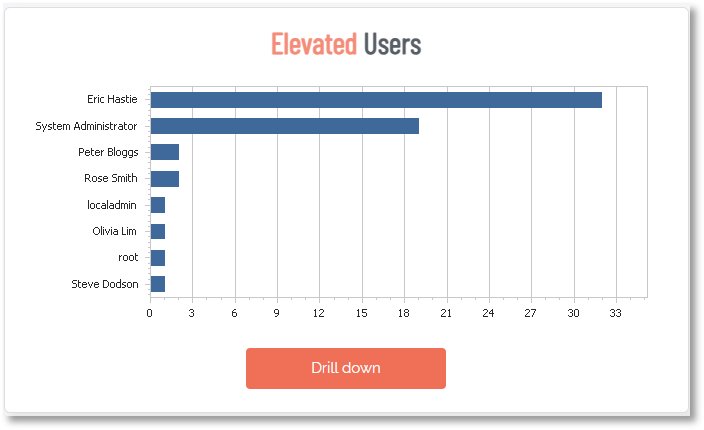
This panel is useful for periodic access reviews. If a user consistently tops the list but their role doesn't require that level of elevation activity, it's worth reviewing whether their current settings are appropriate.
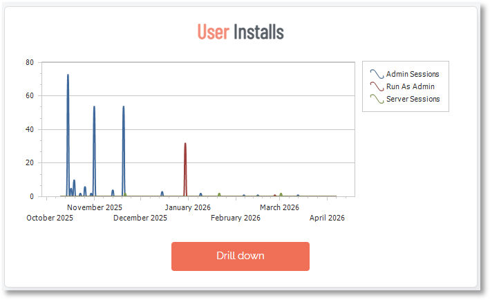
User Installs
This chart tracks software installation events over time, broken down by elevation type: Admin Sessions, Run As Admin, and Server Sessions. Drilling down opens a detailed log of each individual install event, showing the software name, the user who triggered it, the computer it was installed on, and the time it occurred. Each entry also links directly through to the relevant Auditlog entry. You can switch between workstation and server session data using the View dropdown, and filter by subsetting and date range.
High install volume during certain periods (after a company-wide software rollout, for example) is expected. Persistent install activity outside of those windows, especially from unexpected users, is worth a closer look. Unauthorized software installs are one of the most common vectors for malware getting onto endpoints.
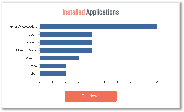
Installed Applications
This bar chart shows which applications have been installed most frequently across your environment, ranked by elevation count. It's drawing from the same elevation data as the User Installs chart, just aggregated differently: rather than a chronological event log, it groups installs by application and shows you a leaderboard. The drill down view includes Software, Vendor, and an Elevations count, along with a "Your top 10" chart. Like User Installs, you can filter by workstations vs. server sessions, subsetting, and date range.
Malware Detection
This panel shows any elevation attempts that were flagged or blocked by OPSWAT MetaDefender, the integrated malware reputation check built into Admin By Request EPM. When a user attempts to elevate an application, MetaDefender checks the file's checksum against a database of over 20 antivirus providers in real time. If the file is flagged as suspicious or malicious, the elevation is either denied outright or quarantined for review.
If this panel shows "No activity", that's generally a good sign. But it's worth making sure MetaDefender is actually enabled in your settings. A blank panel because nothing was caught is very different from a blank panel because the feature is switched off.
OPSWAT MetaDefender can be enabled under Settings in the portal. It's also one of the checks factored into your Security Score, so if your score is flagging it, that's where to go.
Approver Activity
This bar chart shows how many elevation requests each portal administrator has approved or acted on in the selected time period. It's a useful operational view: you can see whether approval workload is evenly distributed across your team, or whether one or two admins are handling the bulk of it.
If you have a large team, this panel can also help you spot inactive approvers. Portal users who haven't approved anything in a while might not need the access they have, which feeds back into your Security Score checks around stale accounts.
If one approver is handling the vast majority of requests, that's a single point of failure. If they're unavailable, requests pile up and users get blocked. Make sure approval responsibility is distributed across enough portal admins to cover absences.
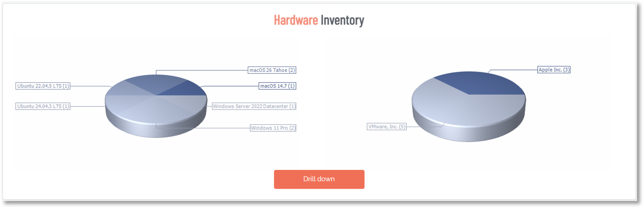
Hardware Inventory
These pie charts break down your enrolled endpoints by OS version (left chart) and hardware vendor (right chart). It's a quick snapshot of what your fleet looks like, useful for understanding your patching obligations and identifying any devices running older operating systems that may be approaching end-of-support.
The Drill down takes you into the Inventory page, which lists all enrolled computers with their assigned user, operating system, hardware model, and software version. You can filter the list by device type (Windows, Mac, or Server), generate a PIN for any device, and export the full inventory to PDF, XLSX, or CSV.
Software Inventory
This chart shows the most common applications installed across your managed endpoints. It pulls from the full software inventory that Admin By Request EPM collects as part of its standard asset tracking, so this isn't limited to applications that were elevated. It's a broader picture of what's running on your fleet.
Use this panel to quickly identify unauthorized, outdated, or unexpected software across the environment. It's also useful for license compliance: if applications are showing up here that require a paid license, you can verify that the install count lines up with what you've purchased.
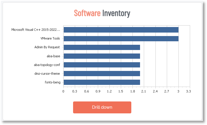
This panel is a good candidate for a regular export. Running a monthly or quarterly CSV gives you a running record of what's been installed across your fleet over time, useful for audits, offboarding reviews, or just keeping tabs on software sprawl.
Local Admins
This panel shows a ranked list of accounts that currently hold local administrator rights across your endpoints. It's one of the most security-critical panels on the Reports page.
The goal of deploying Admin By Request EPM is to remove permanent local admin rights and replace them with just-in-time elevation. This panel helps you verify that's actually happened. Ideally, the only accounts you should see here are necessary service accounts or system accounts. If regular user accounts are still appearing, those should be reviewed and removed.
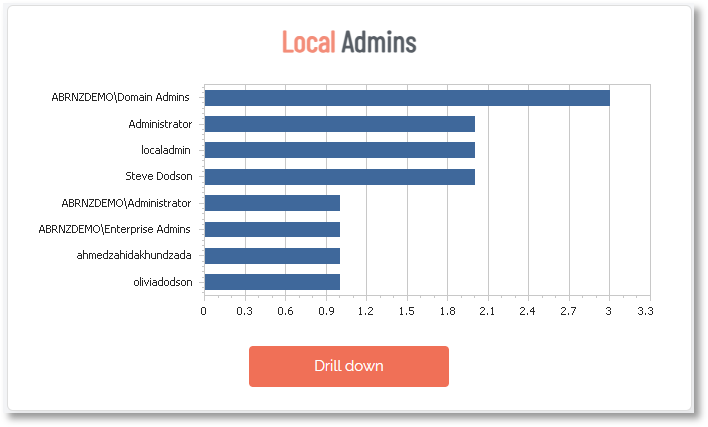
Run this panel as a regular check after any new device enrollment or onboarding. New devices sometimes arrive with default admin accounts that weren't caught during setup.
View Configuration
At the bottom of the Reports page, View Configuration lets you adjust what the charts show without changing any of your actual settings. There are three controls:
-
Spline charts: Sets the time range for the line charts (User Elevations, User Requests, and User Installs).
-
Bar charts: Sets the time range for the bar charts.
-
Sub Settings: Filters all charts to show data from a specific sub-setting group (a specific department or user group) rather than the entire tenant.
There's also a Mail Me This View button that sends a snapshot of the current Reports page to your email. This is handy for sharing a summary with stakeholders who don't have portal access, or for keeping a periodic record of your environment without having to log in and export manually.